

reflecting back and looking forward on an organization's successes in a BOLD AND highly VISUAL ANNUAL REPORT.
CLIENT
Tamarack Institute for Community Engagement
Challenge
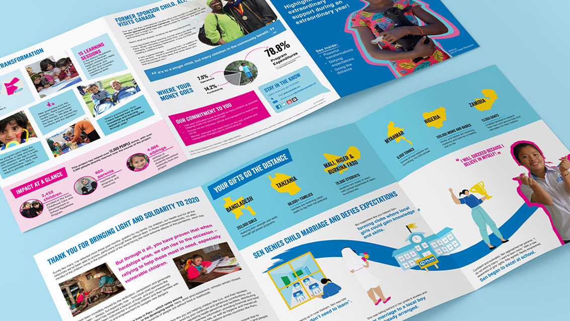
Create the 20th anniversary edition of the organization's annual report. The Tamarack Institute works to create lasting community change by consulting and educating leaders in the public and private sector. The Institute wanted their 20th anniversary report to have a retrospective focus and to "show rather than tell" via impactful visuals and statistics.
solution
The report design highlights the transformative nature of the 20th anniversary edition of the annual report, using the arrow as a graphic device to highlight the report’s theme “Looking Back and Looking Ahead”. The graphic language relies on visual representations of data and infographics to quickly convey statistics to the reader. Large numbers and use of the bold, saturated colour palette further draw the eye and help to efficiently convey information. The dominance of whitespace on the page gives the report a clear, transparent feel that is approachable, while full-colour imagery and colour-blocked headings add colour and interest. Large pull-quotes emphasize the voice of Tamarack’s supporters and contributors, while adding texture to the page.
Design Touch Points
Report, Information Design