channelling the interconnection of community and place at the heart of a grassroots human rights organization.
CLIENT
Challenge
Create a renewed brand identity for the Victoria-based human rights organization, which advocates for individuals who have experienced discrimination and are seeking to file human rights complaints to the B.C. Human Rights Tribunal.
solution
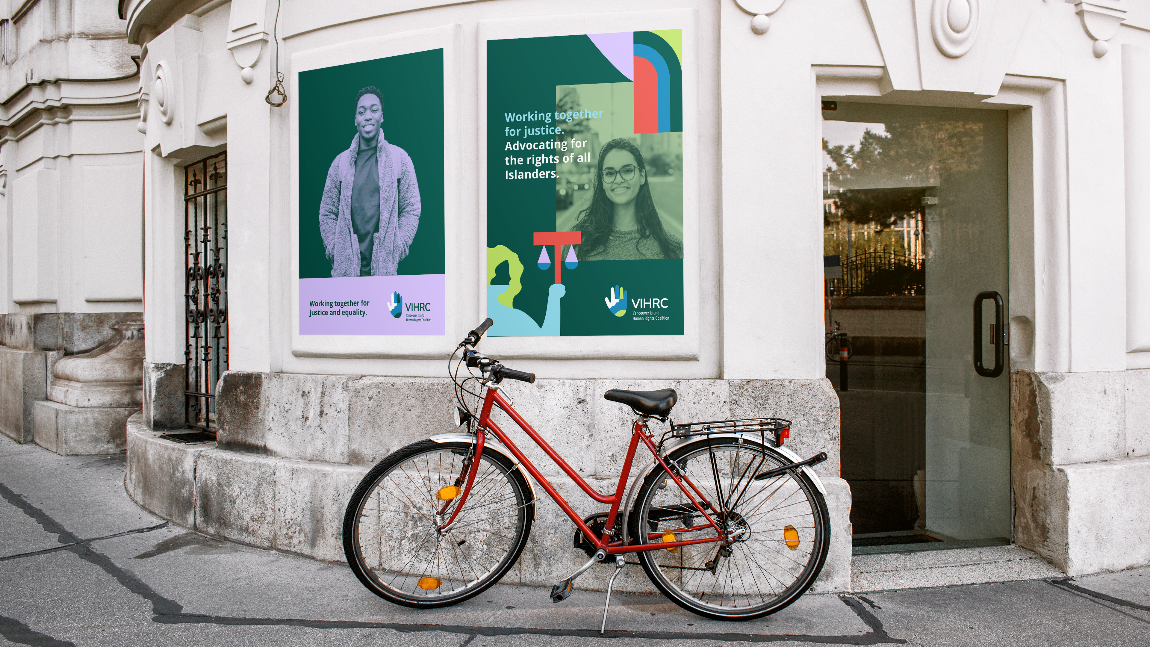
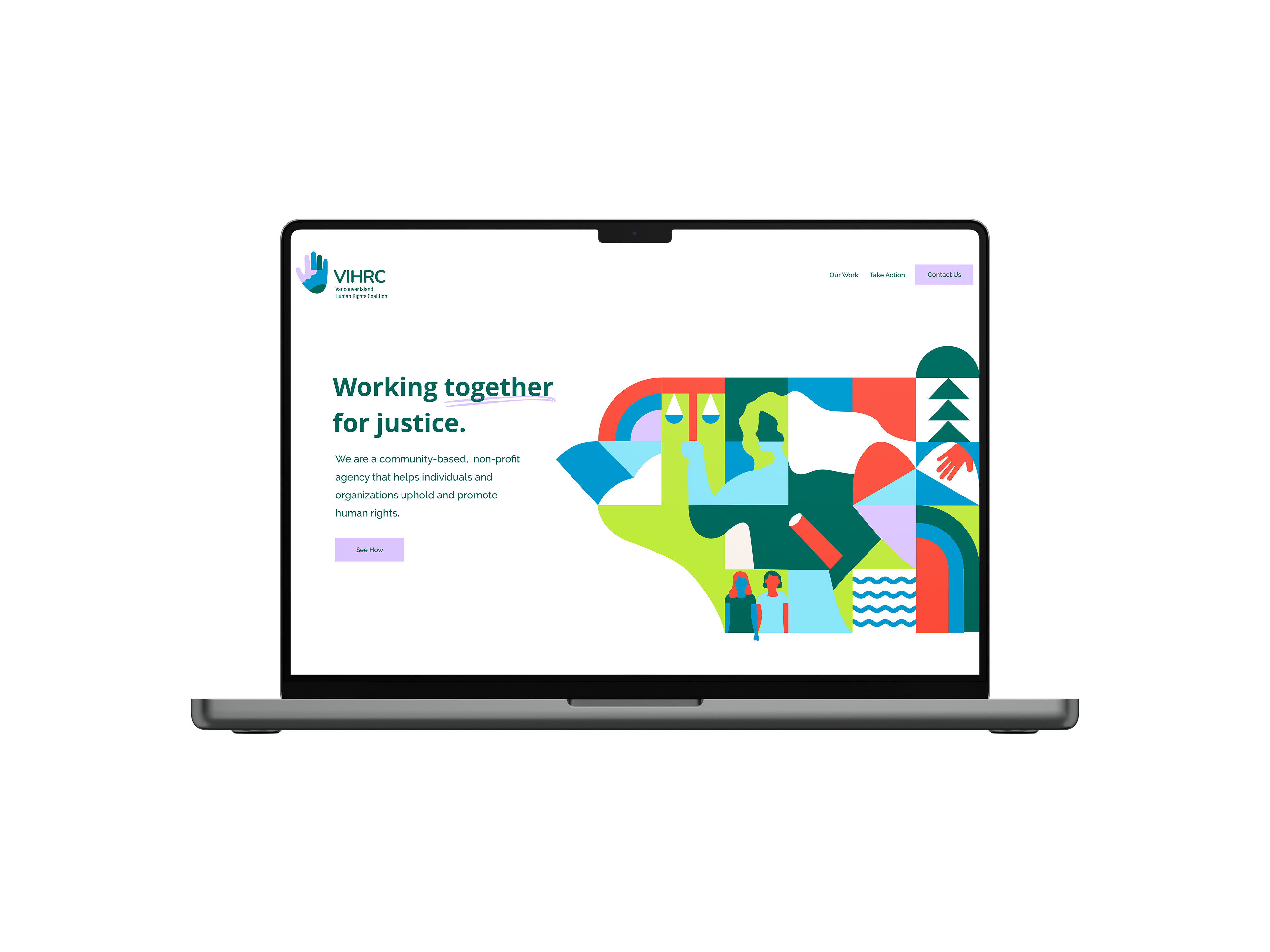
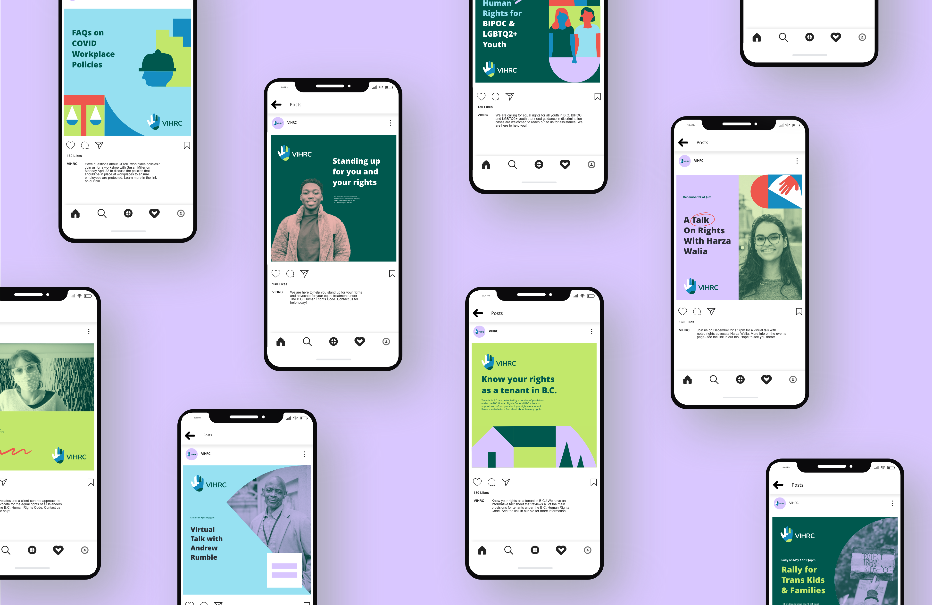
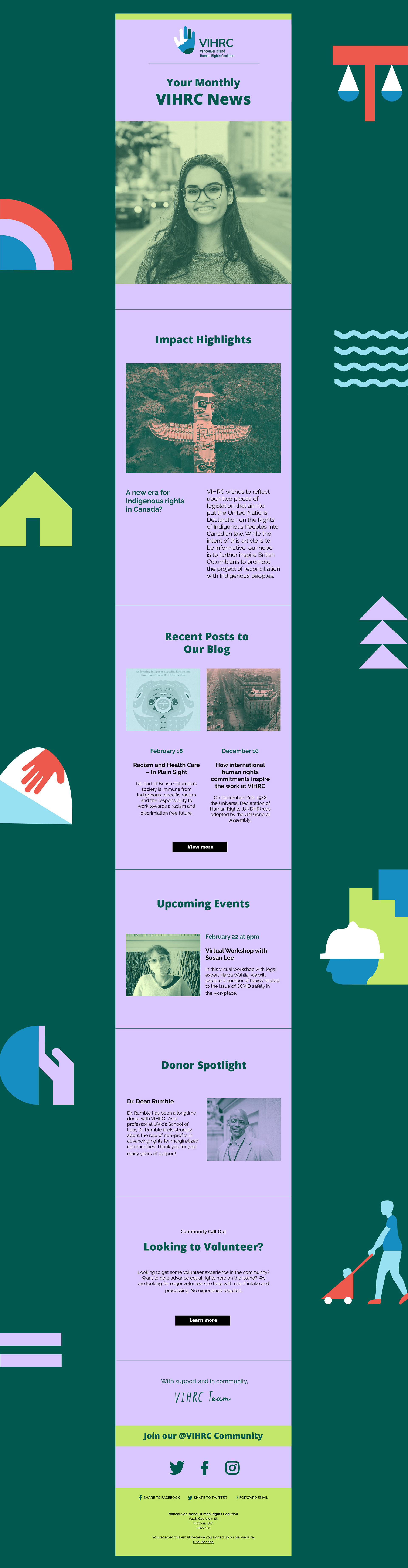
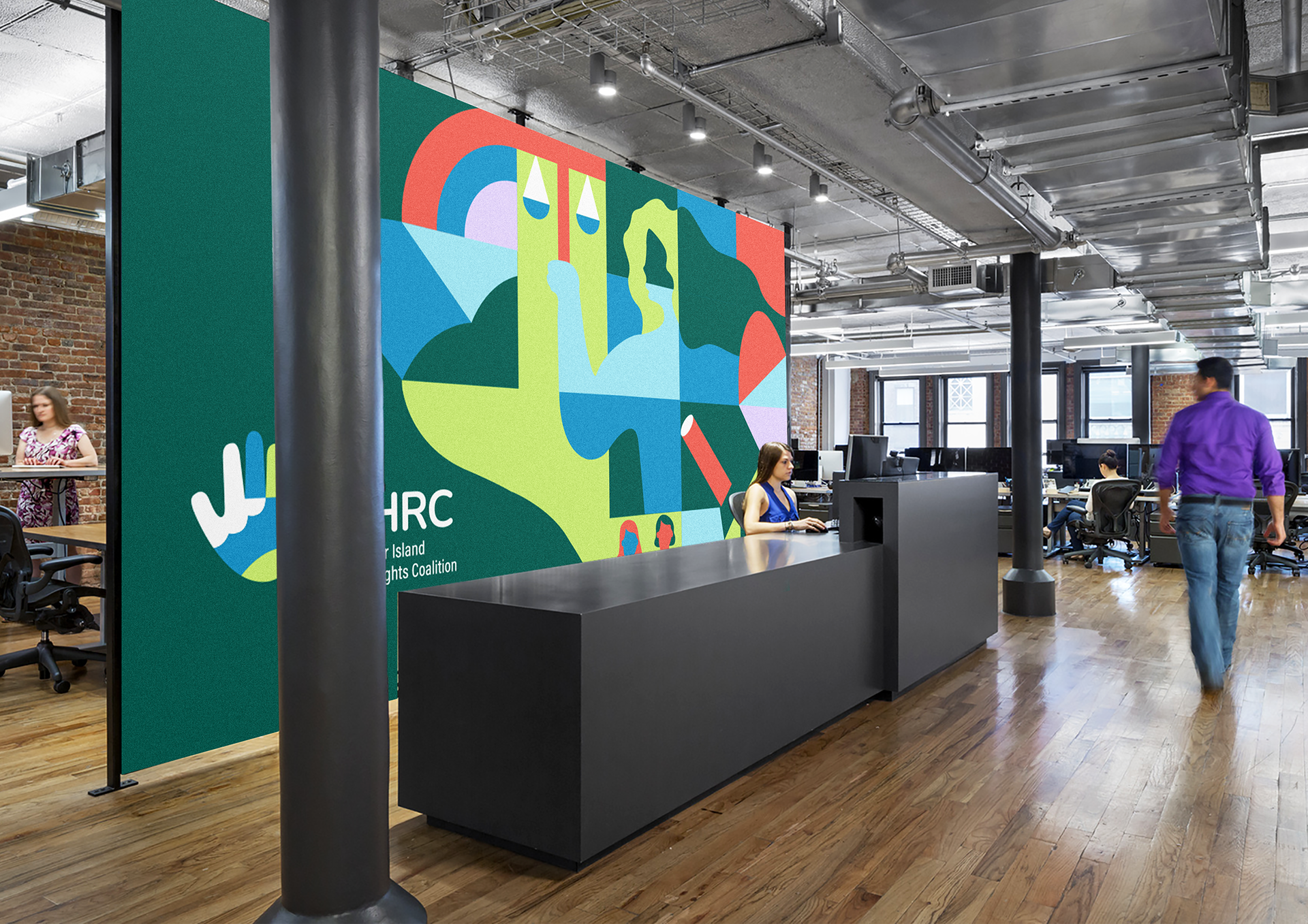
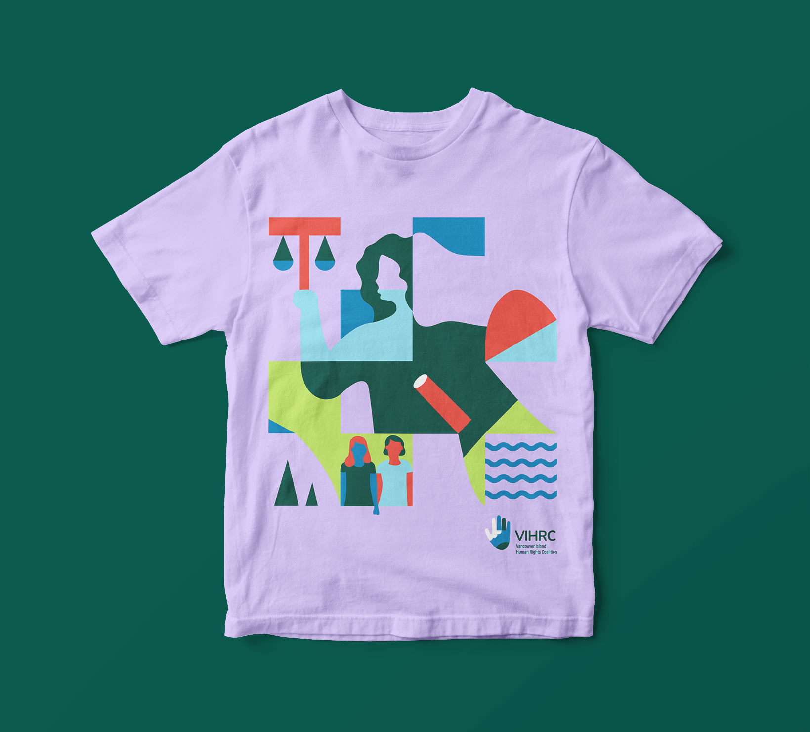
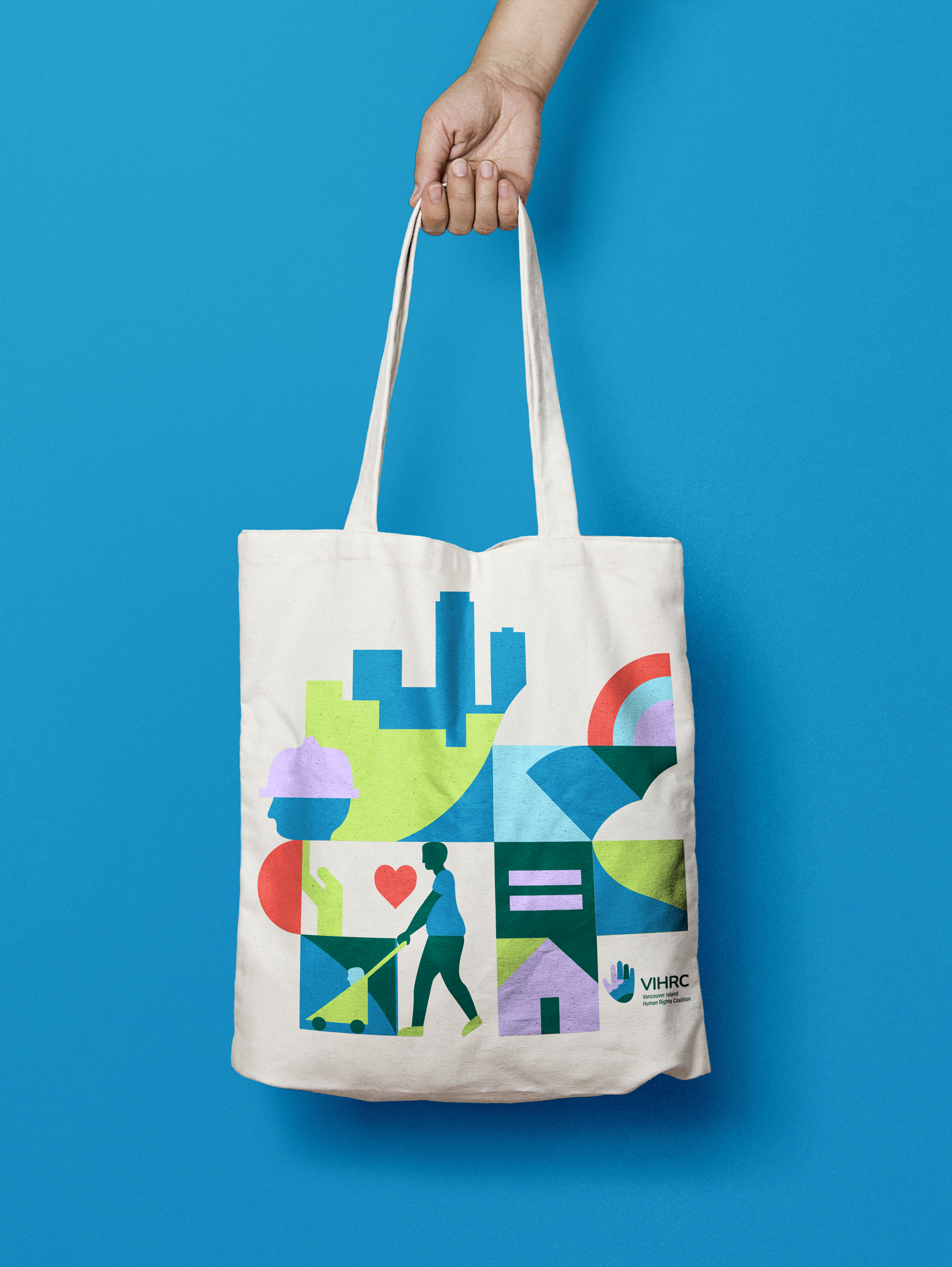
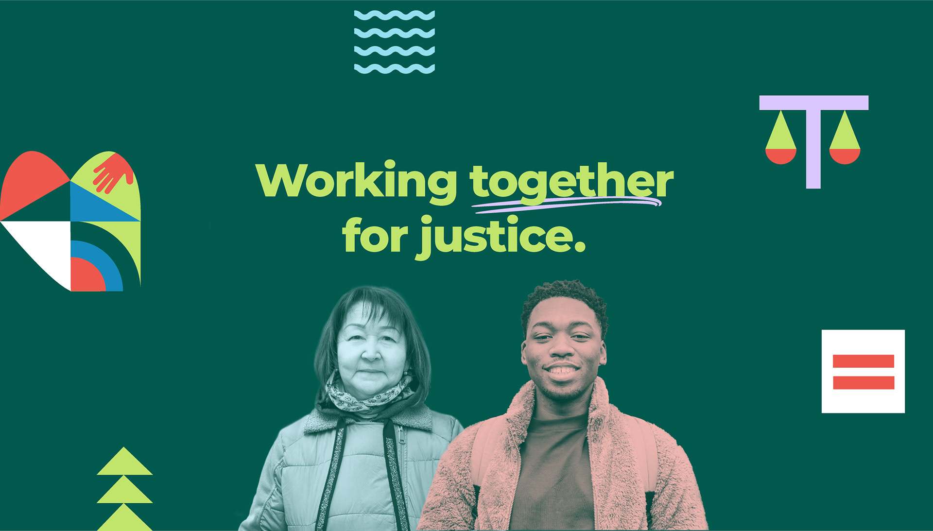
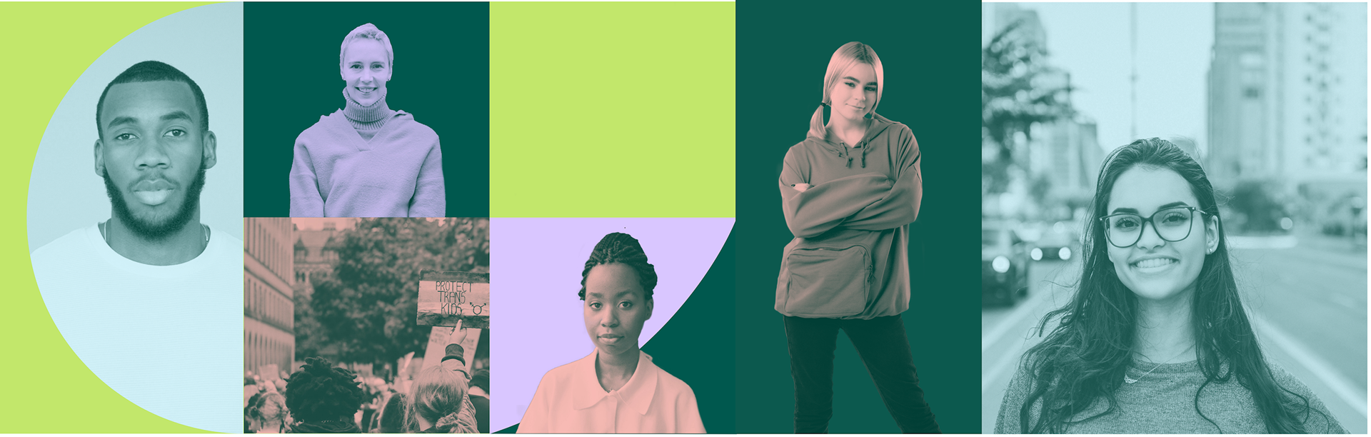
The VIHRC brand identity is centered on the notion of a coalition and the strength and positive change that VIHRC achieves through its partnership with the community on human rights issues. The revised look+feel for the organization clearly situates VIHRC as an active and positive force on the Island, with abstract illustrative references to Island geography and a vibrant and Island-based colour palette. A central Community Patchwork illustration reflects the diversity of the areas in which VIHRC works and the unique geographical diversity of the Island itself. Portrait photography of individuals from all walks of life give a powerful and immediate sense of what the organization is about and keeps the message focused on people at the centre of VIHRC’s work. Above all else, this concept reflects VIHRC’s vision for a better society and how it works with the community to achieve it.
design touch points
Branding, Illustration, Print, Digital, Social Media, Newsletter (Mailchimp) and Web Design
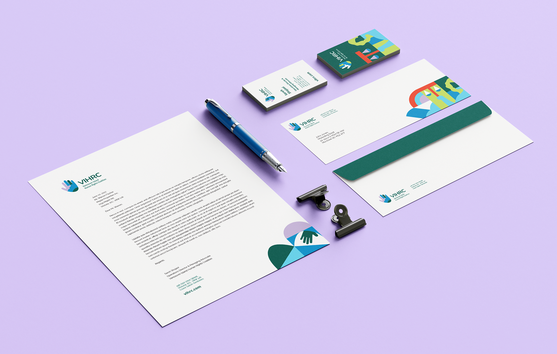
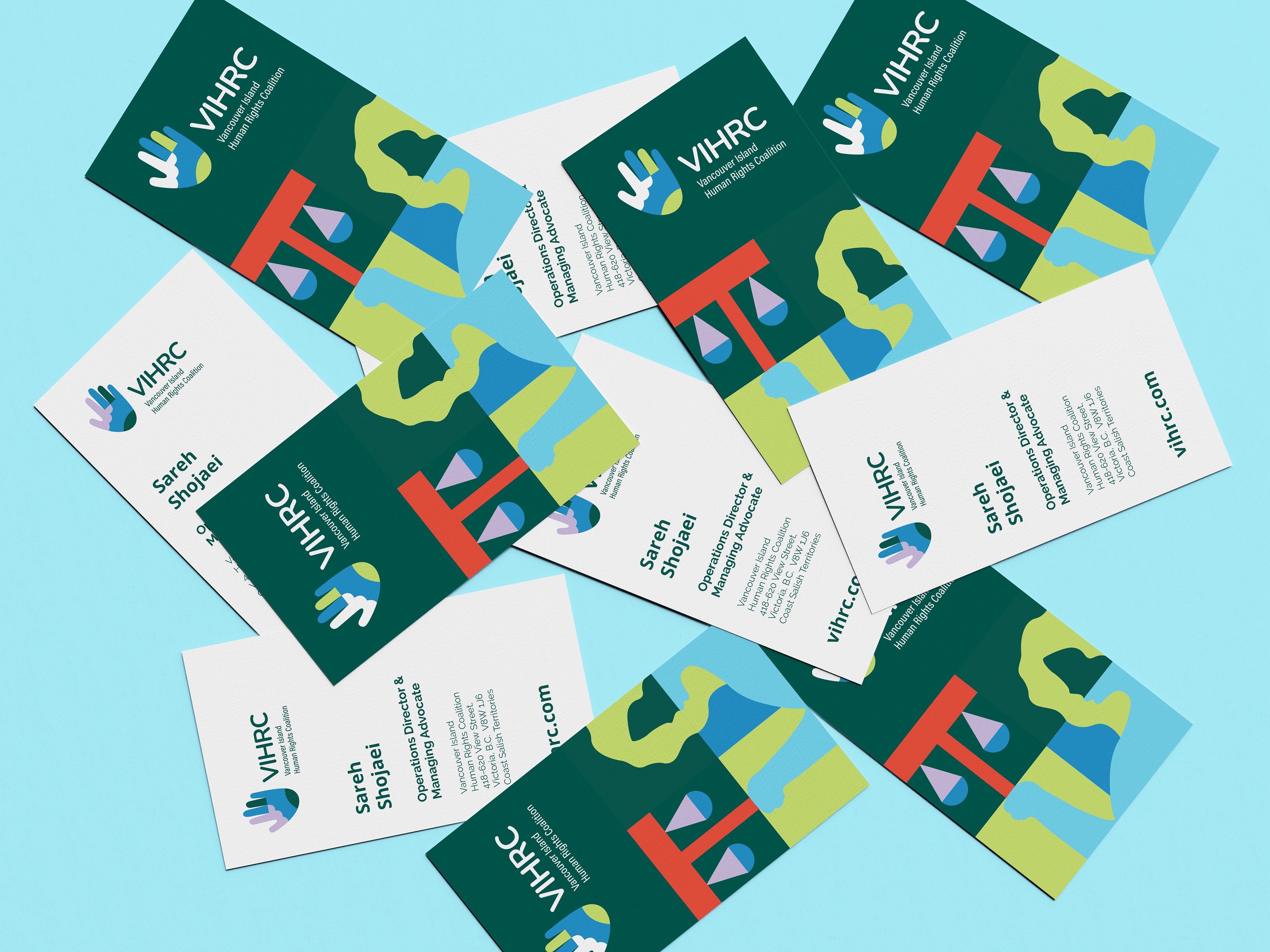
Logo
The logo evokes a sense of unity and interconnectedness that is central to VIHRC. It emphasizes the strength of the coalition that is created when members of the community work together to uphold rights and equity. The logo’s hand shape immediately evokes the human and client-centred work that is central to VIHRC’s mandate. The hand shape is created via abstract references to people - clients and advocates at VIHRC - and the rock and water shapes - the Island itself. These elements work together to create the strong, Island-based coalition of VIHRC.
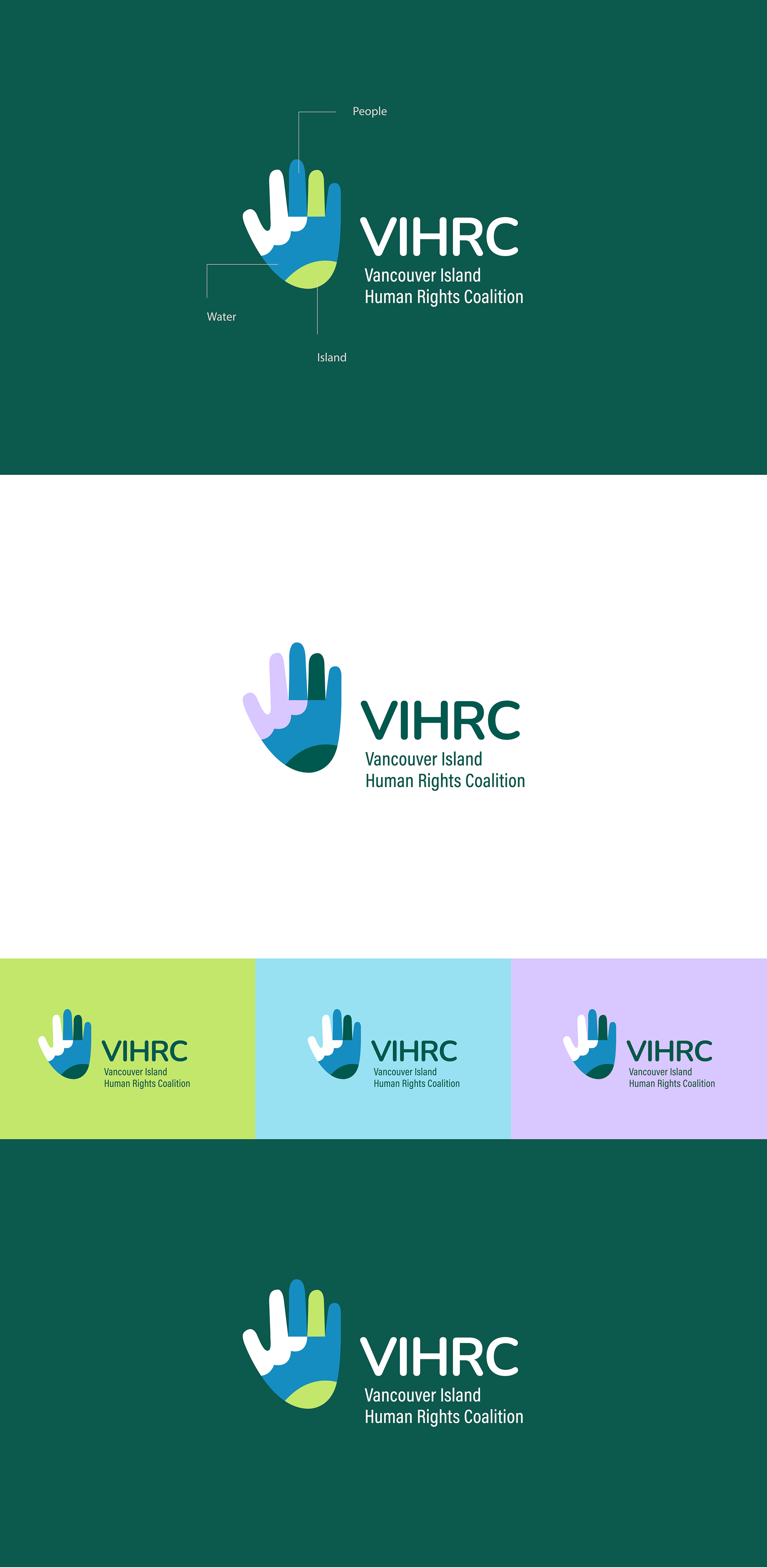
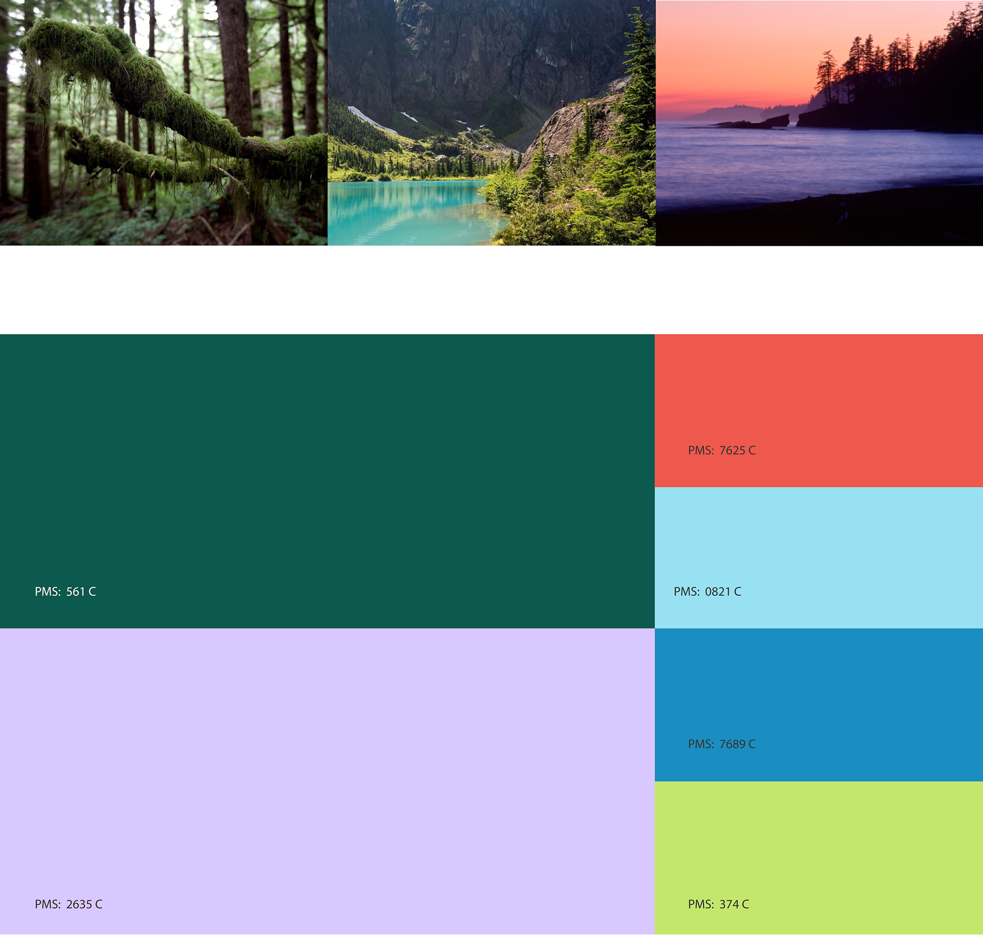
Colours
The colours are inspired by and reflect Vancouver Island itself. Drawn from images of classic landscapes and spaces on the Island, this vibrant yet limited palette evokes the land, sky and earth. The goal of the colour palette is to highlight the interconnection of VIHRC and its mandate with the Island community.
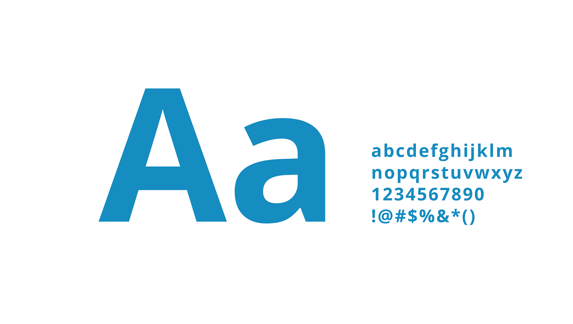
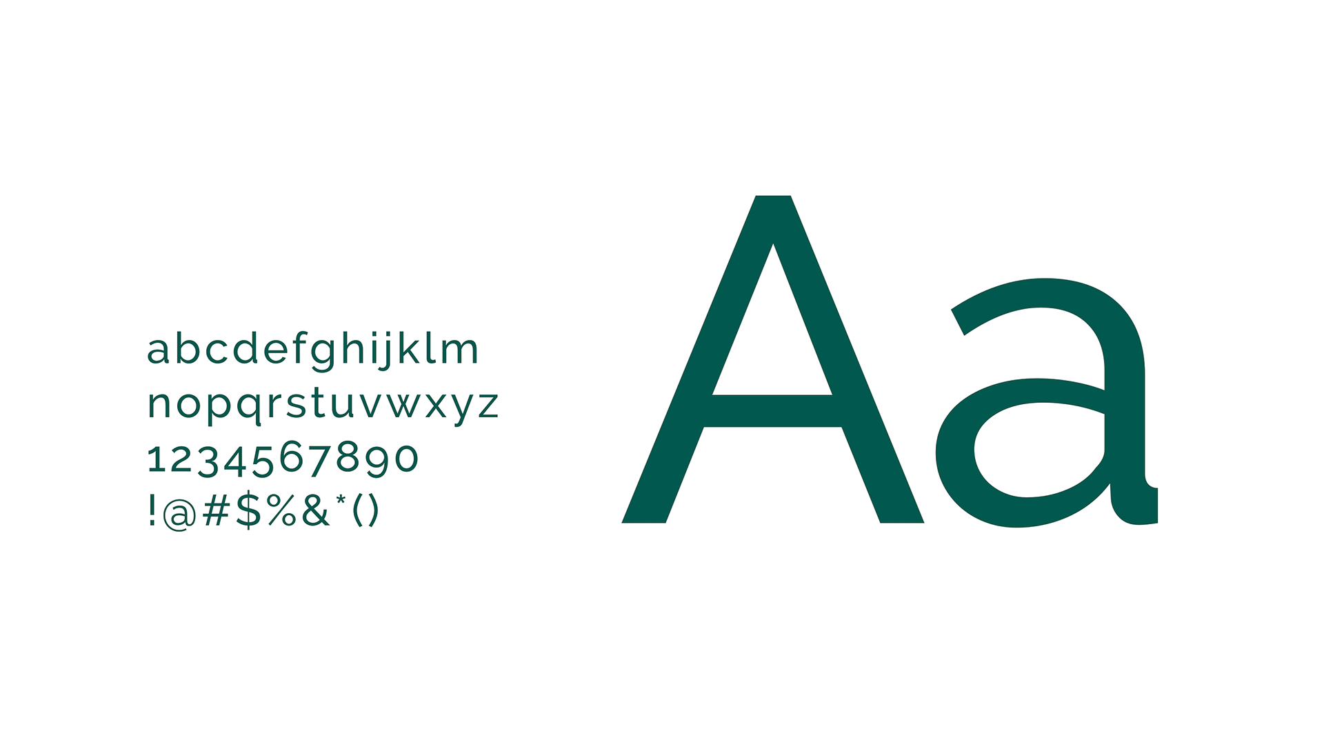
Typography
The primary typeface is Open Sans, a clean and modern sans serif typeface especially designed for legibility across print, web and mobile interfaces. This font is used for headlines and larger titles.
Raleway is a simple yet elegant sans serif font, adding a sleek and more serious tone to designs. This typeface is used for general text.
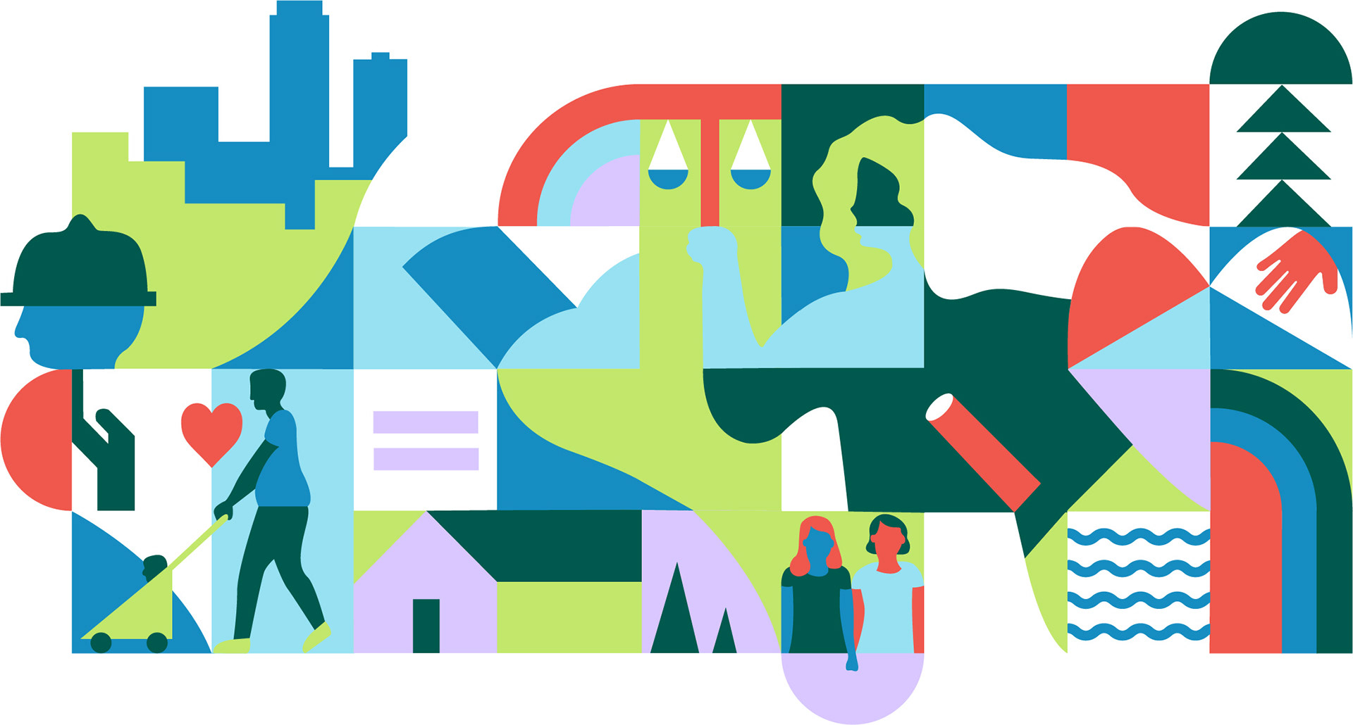
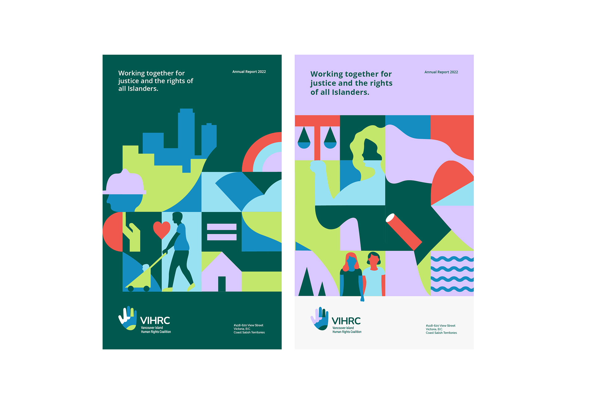
Modular illustration
The central component of the brand identity is the Community Patchwork illustration. The illustration has a modular composition, allowing it to be broken down and used in parts depending on the needs of an application or context.
The illustration has 3 key clusters of blocks that represent the major components of VIHRC’s mandate: advocacy, education and partnership. These central blocks are supported by additional blocks that evoke the various contexts addressed by VIHRC’s work (eg. housing and employment), as well as Island geography. The illustration’s modular and patchwork style emphasizes the coalition that is VIHRC, with members of the community working together to spread the message of human rights and equity in the community. VIHRC’s advocacy makes the community a better place, and this illustration reflects the shared vision for a better future that VIHRC works to achieve.