
a quirky and playful packaging design for an unconventional kids' beverage.
Challenge
Create the brand identity and packaging design for a carbonated coconut water beverage for children, flavoured with imperfect fruit.
Solution
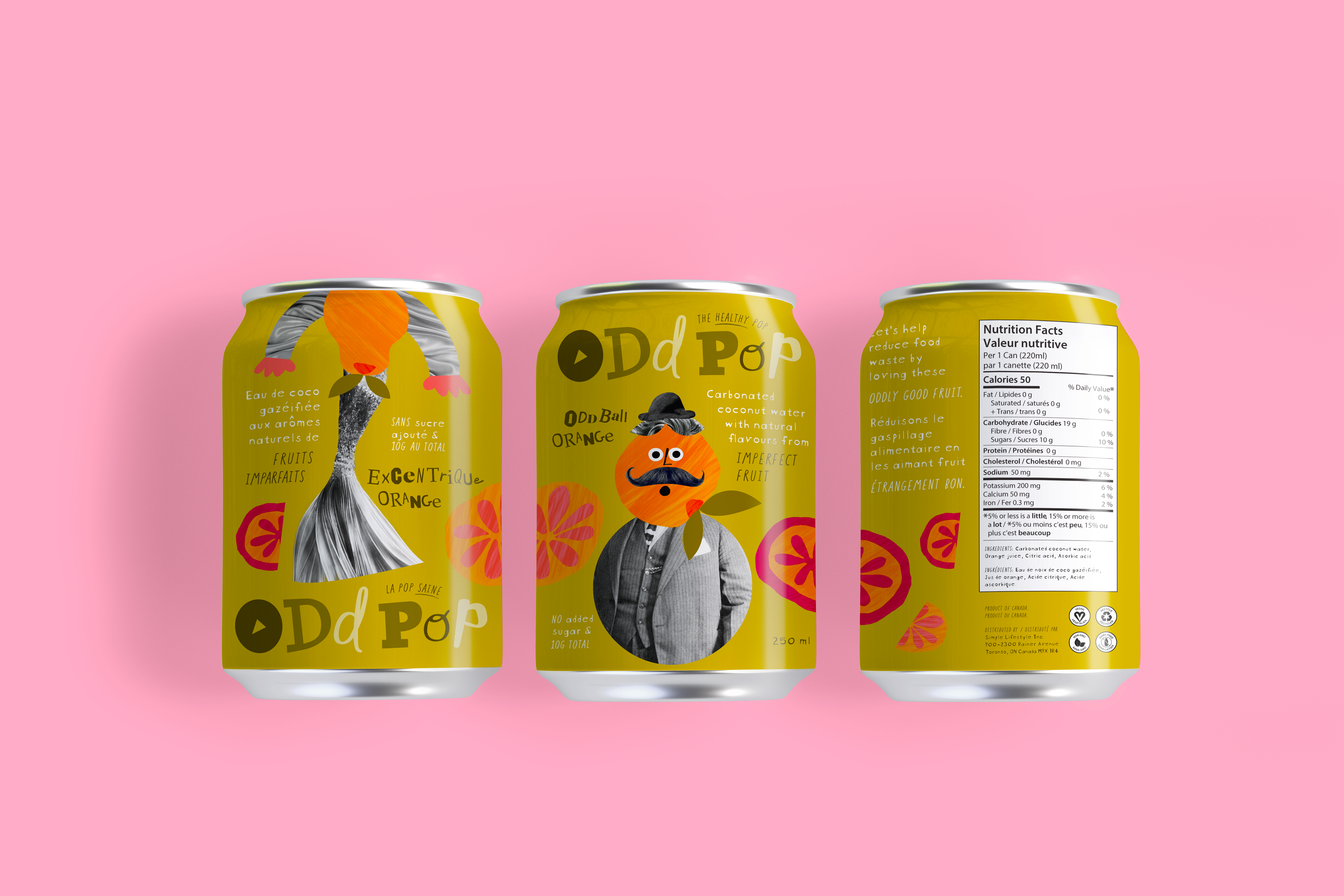
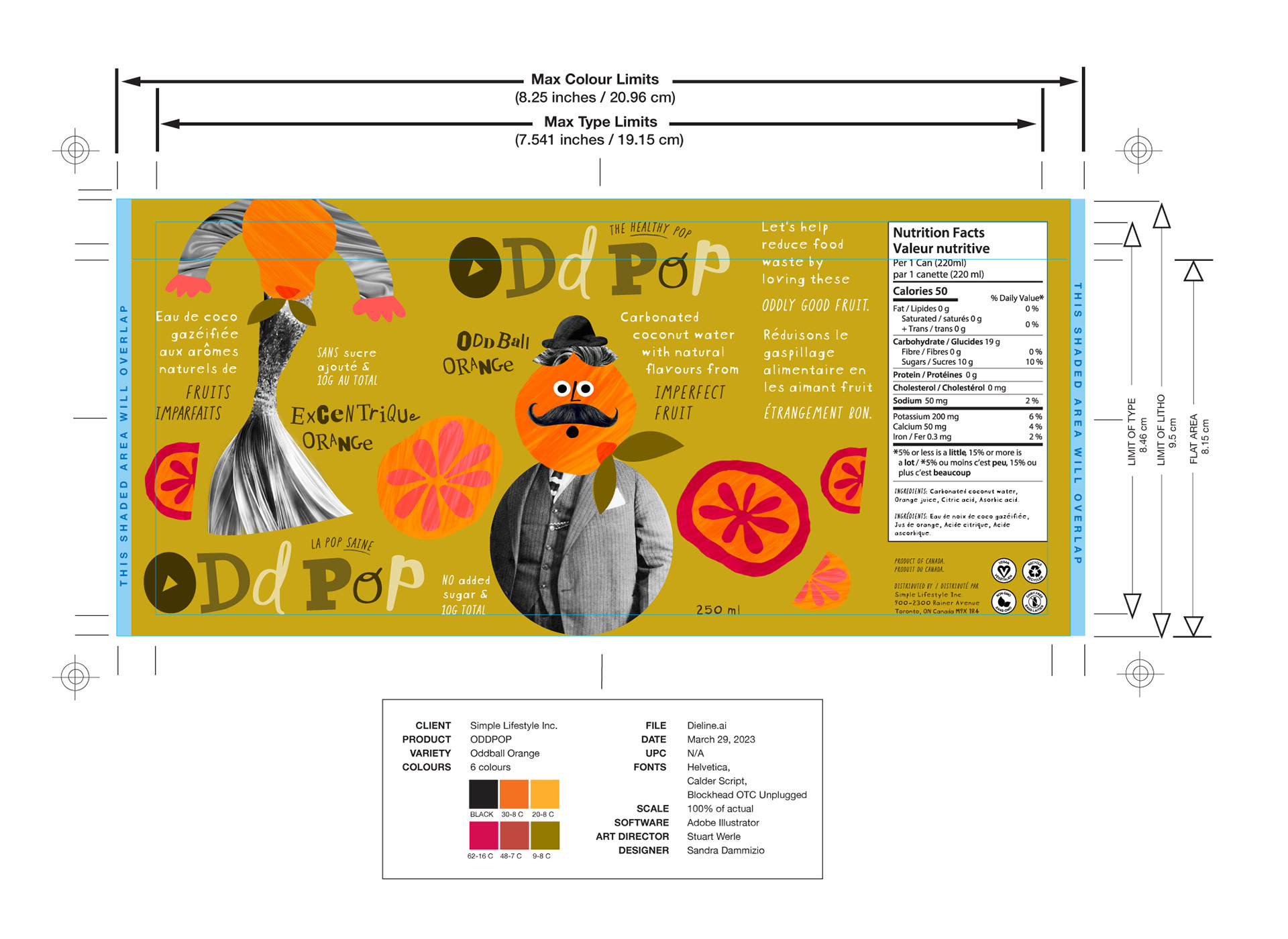
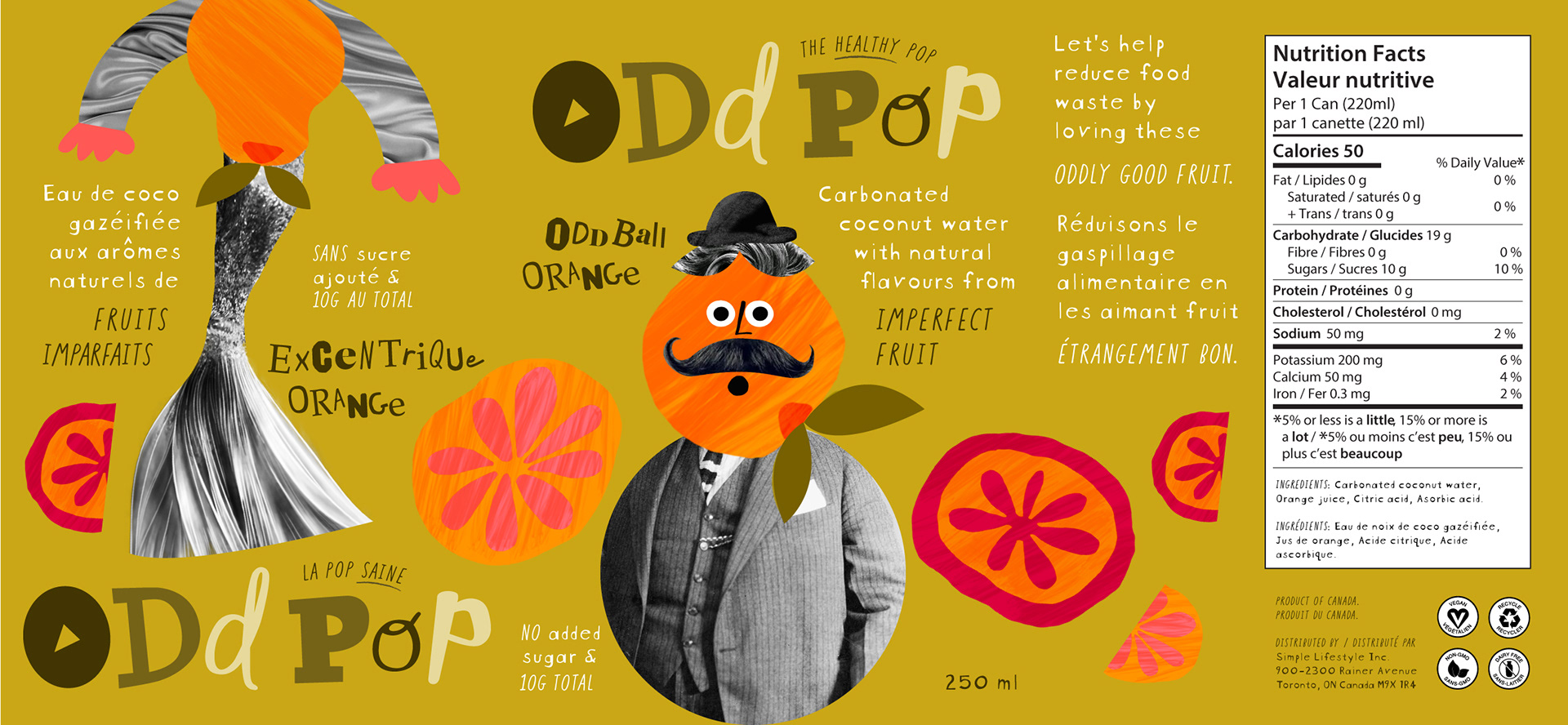
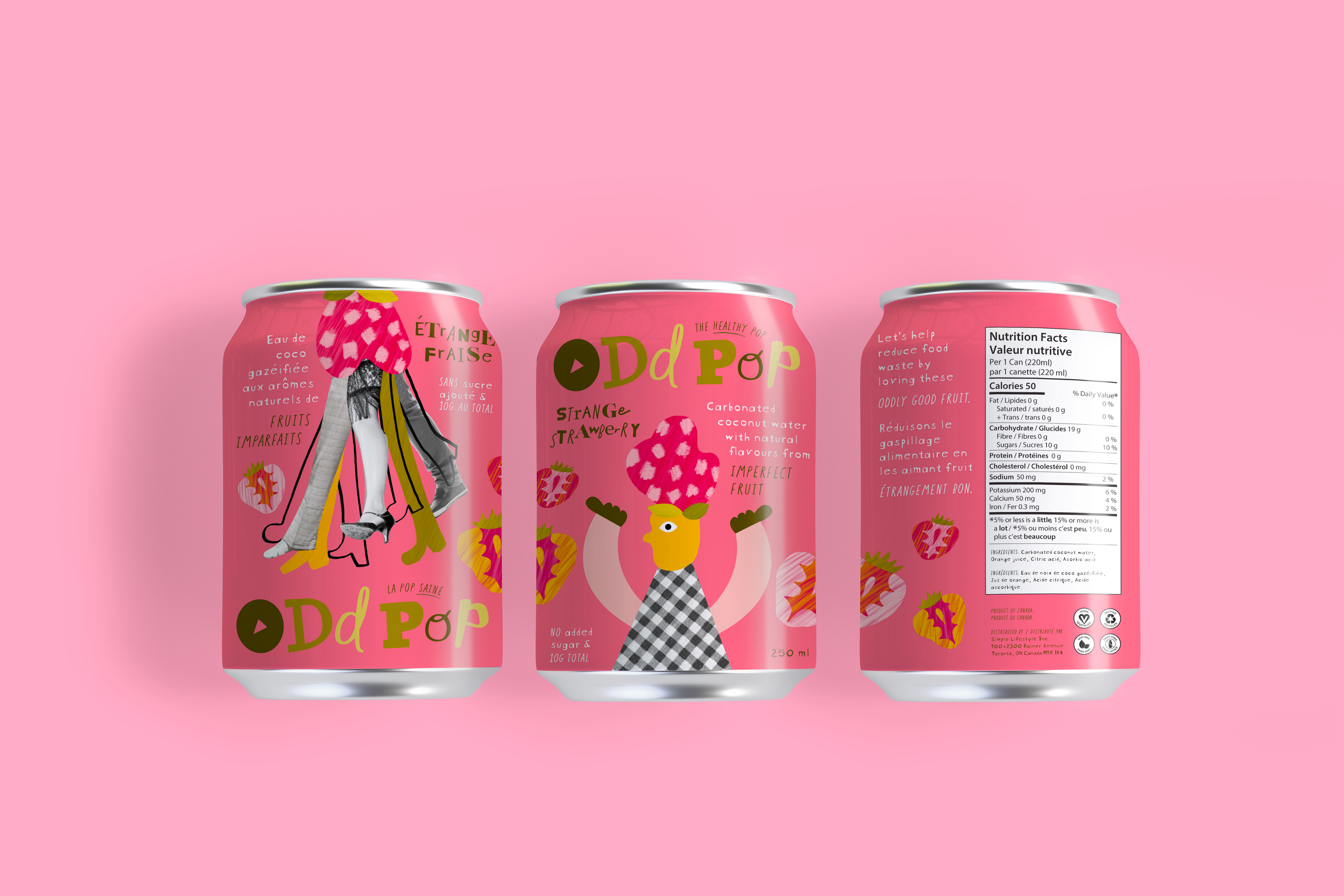
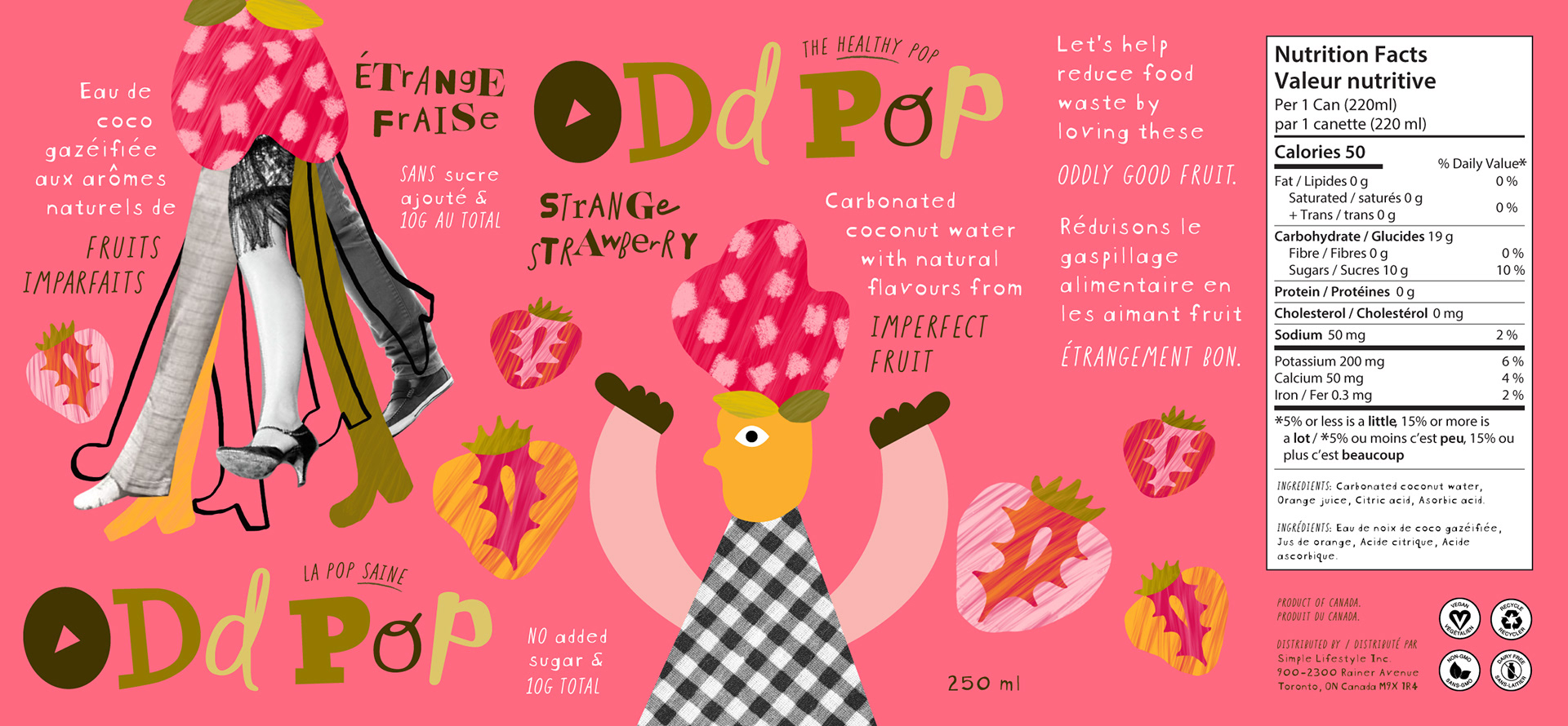
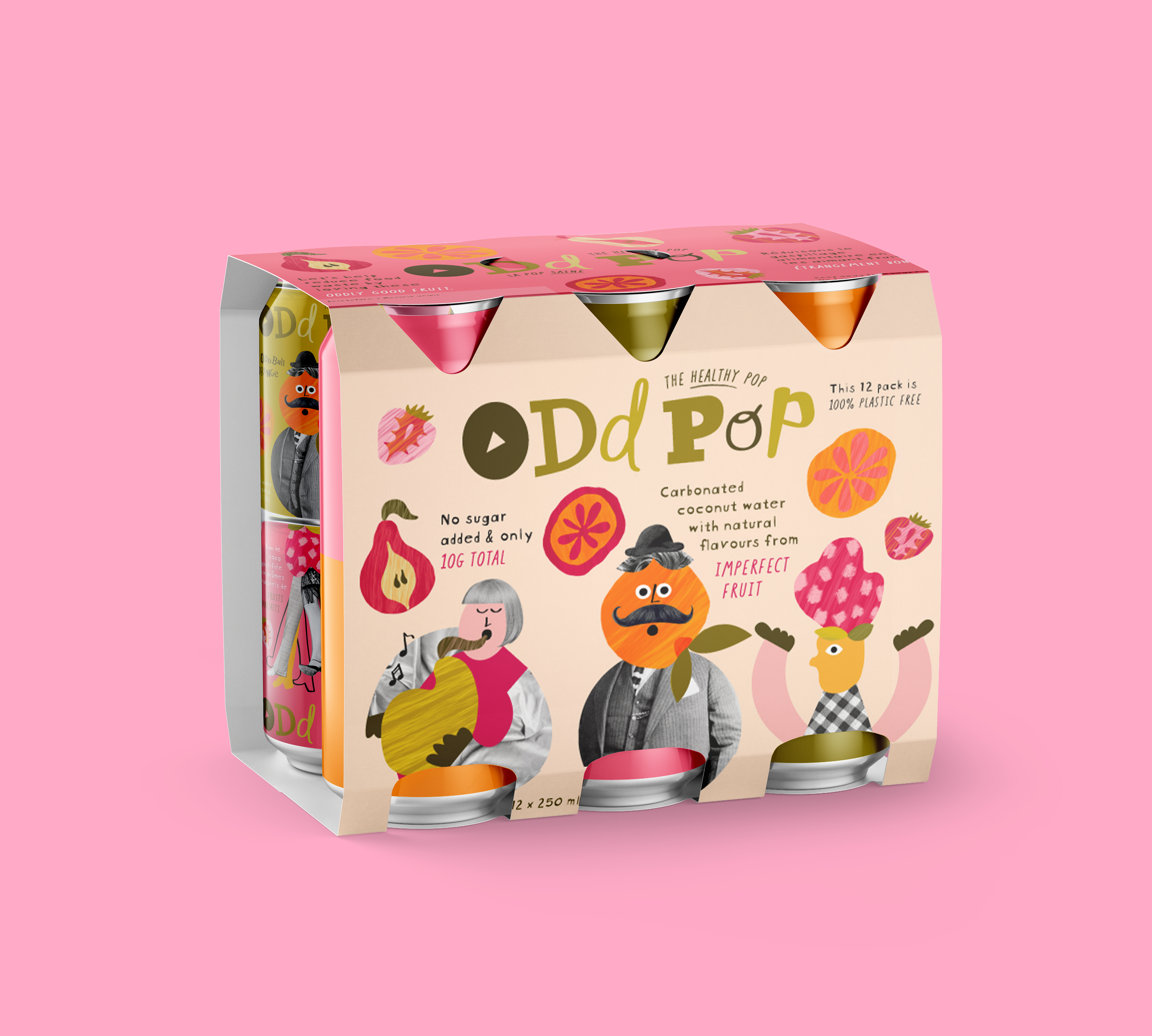
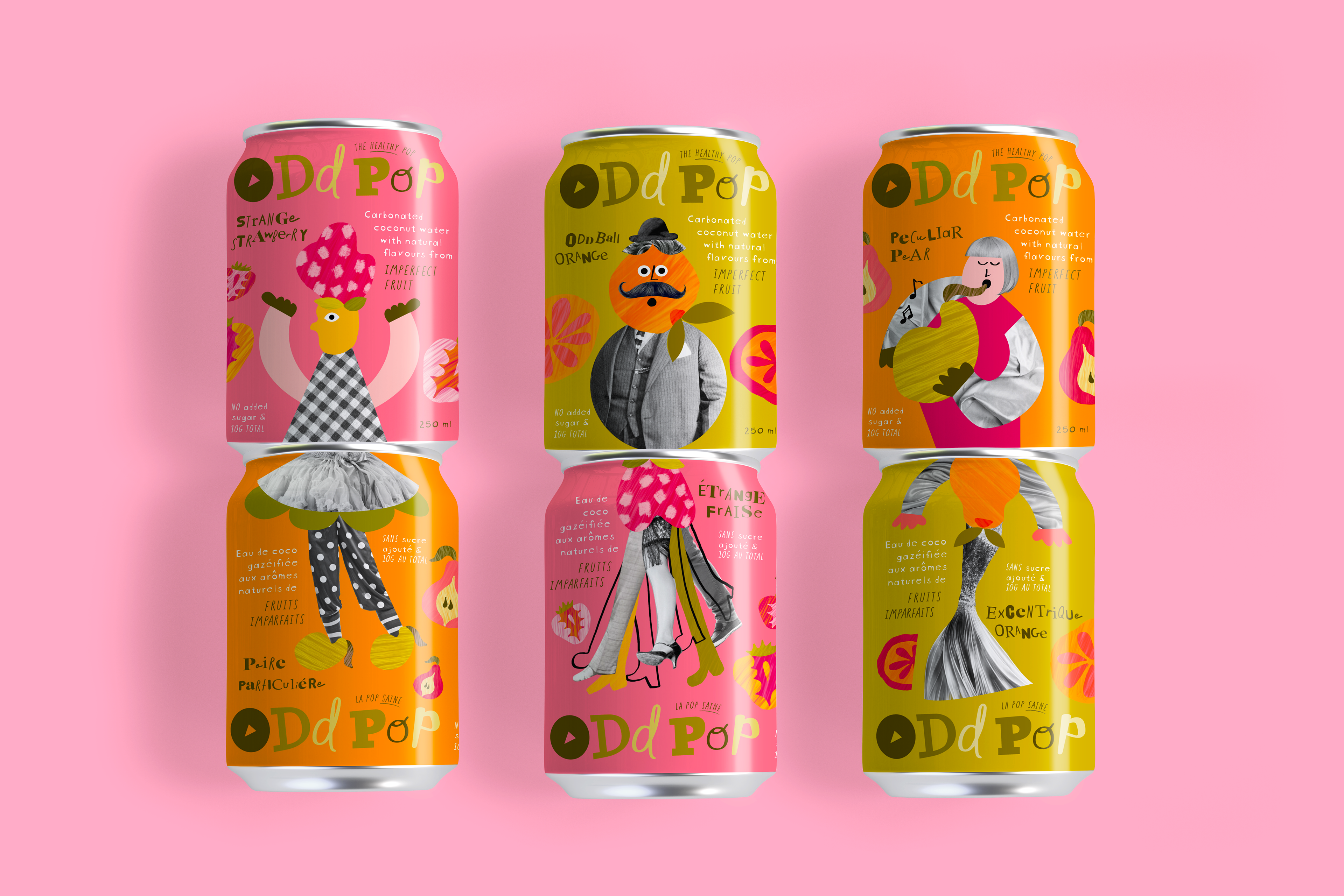
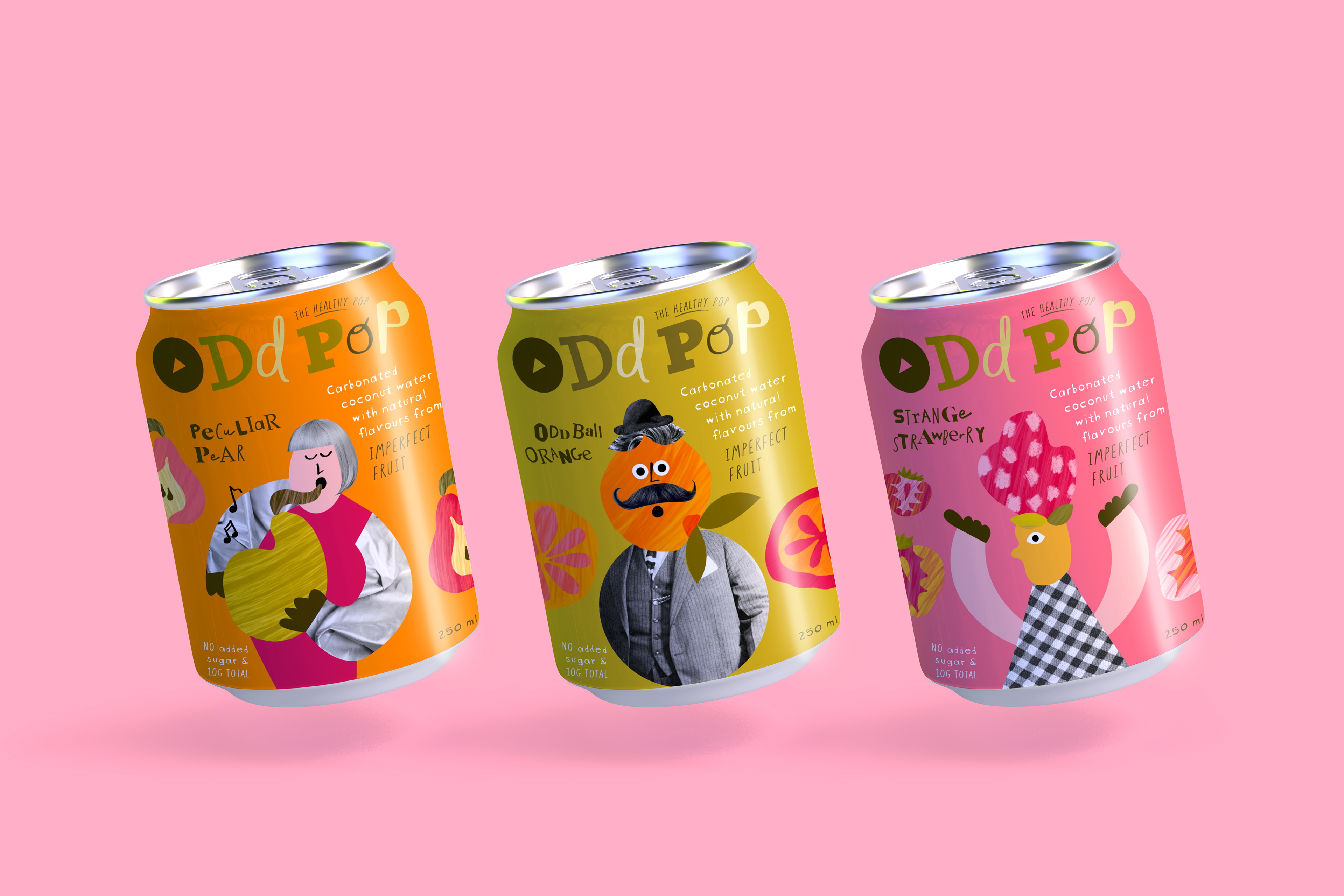
The branding and packaging for ODDPOP is quirky, playful and unexpected. Collage-like graphics combining painterly graphics with vintage black and white photography give the brand a DIY and mix-and-match look, tied to the idea of imperfection as it relates to the use of imperfect fruit in the flavouring of the beverage. The DIY look of the brand is further evoked by the use of mixed and irregular type characters for copy. Lush and vibrant fruit-inspired colours reflect the healthy yet flavourful positioning of the brand. Cans are designed to be stacked in different combinations, with each can having a top and bottom design, making the product fun and interactive.
Design Touch Points
Branding, Packaging Design, Illustration
🏆 This project won Best of Show in Issue 72 of Creative Quarterly magazine, a 2023 RGD Student Award and a 2023 RGD Branding Award in the Packaging category, and an Indigo Award for Branding for Beverages.
Concepts
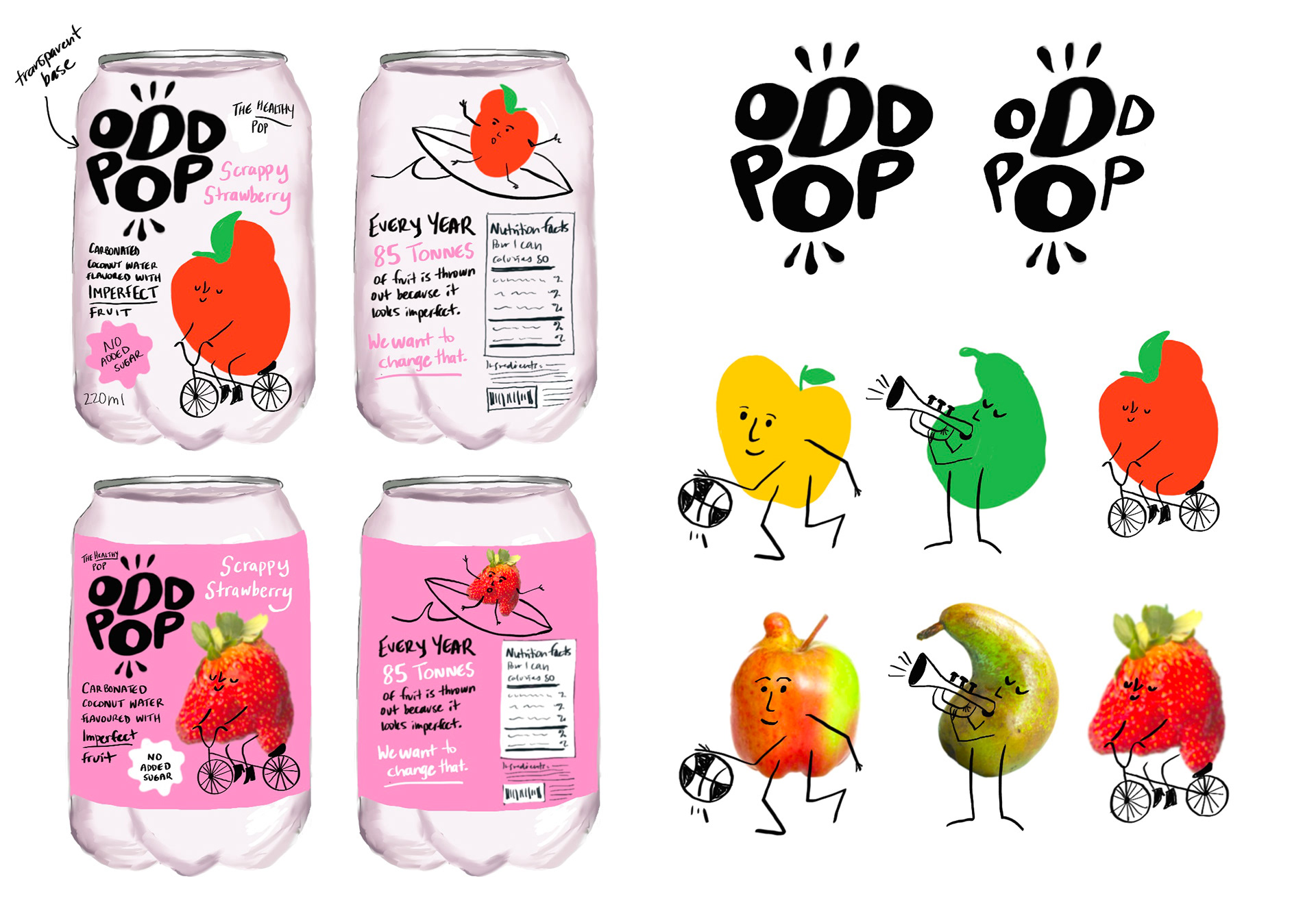
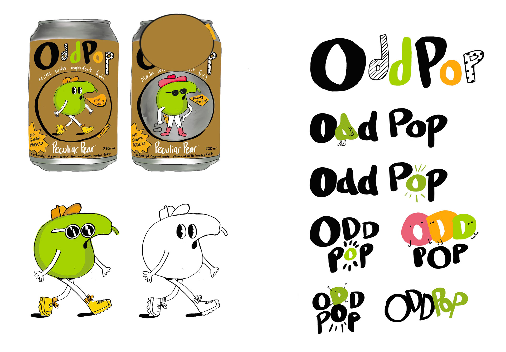
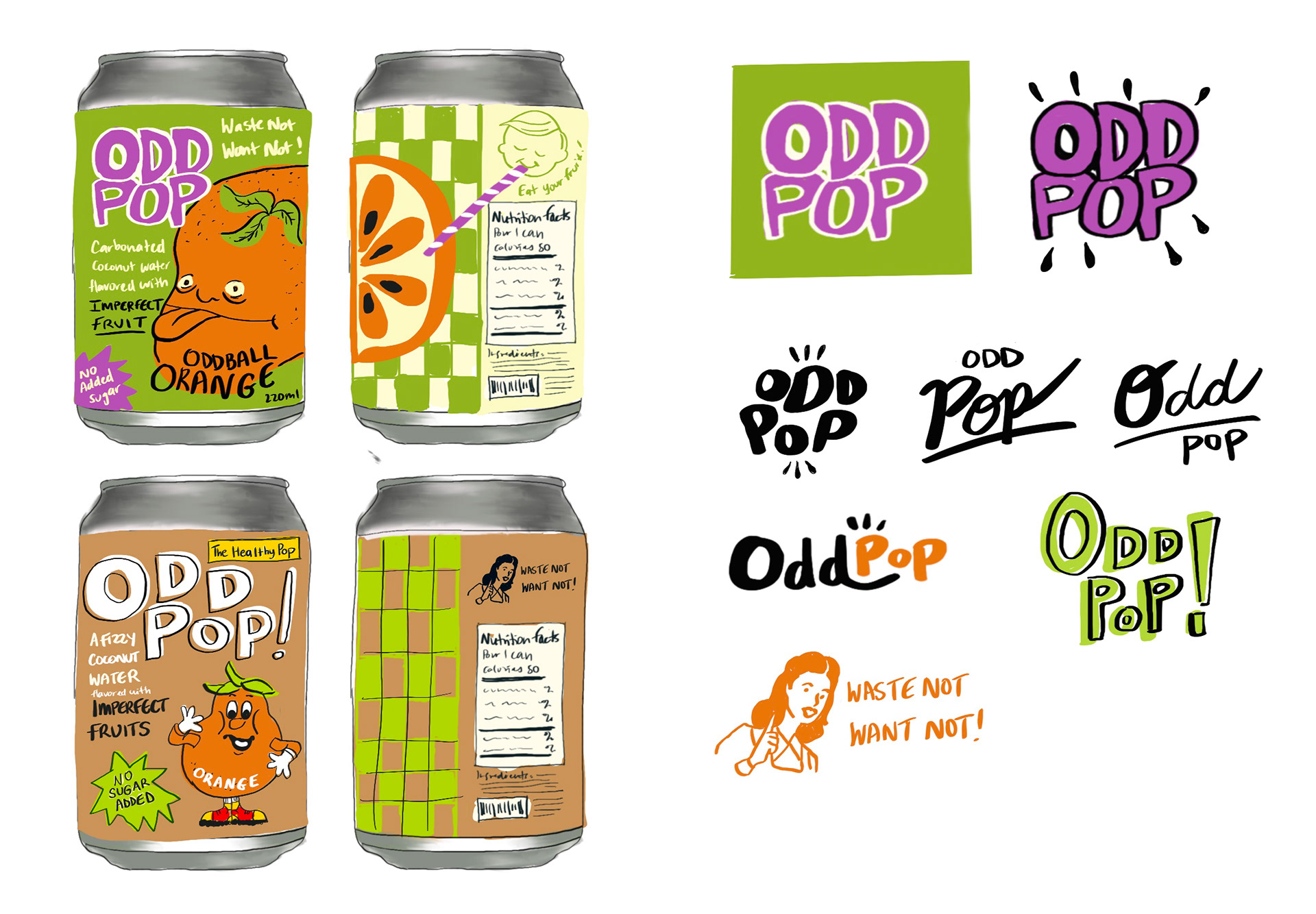
The brand positioning for ODDPOP is healthy, playful and unexpected. As “the healthy pop” it is an appealing alternative to sugary kids beverages. A number of concepts playfully explored how to use the odd shapes of imperfect fruits to create fun characters for the brand graphics. These included the idea of “fruits in disguise” and even retro looking designs that harkened back to a time of less waste.

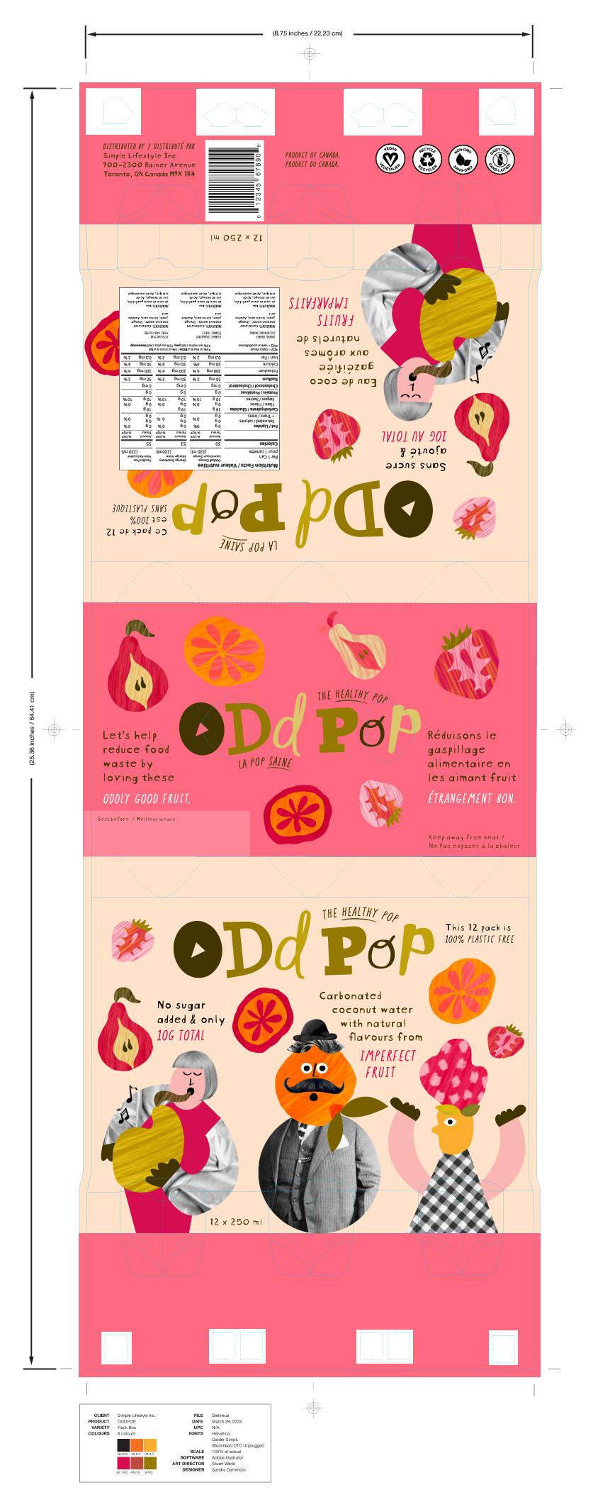
Final packaging dielines
Three flavour SKUs have complimentary designs allowing them to be stacked and combined to create fun character composites. A box design was also created for the pack to be sold at retail.