a punchy, bold design for a recreational roller skate brand's identity and consumer packaging.
Challenge
Create the brand identity and packaging design for a roller skate brand, reflecting the brand's desired target consumer and market positioning.
Solution
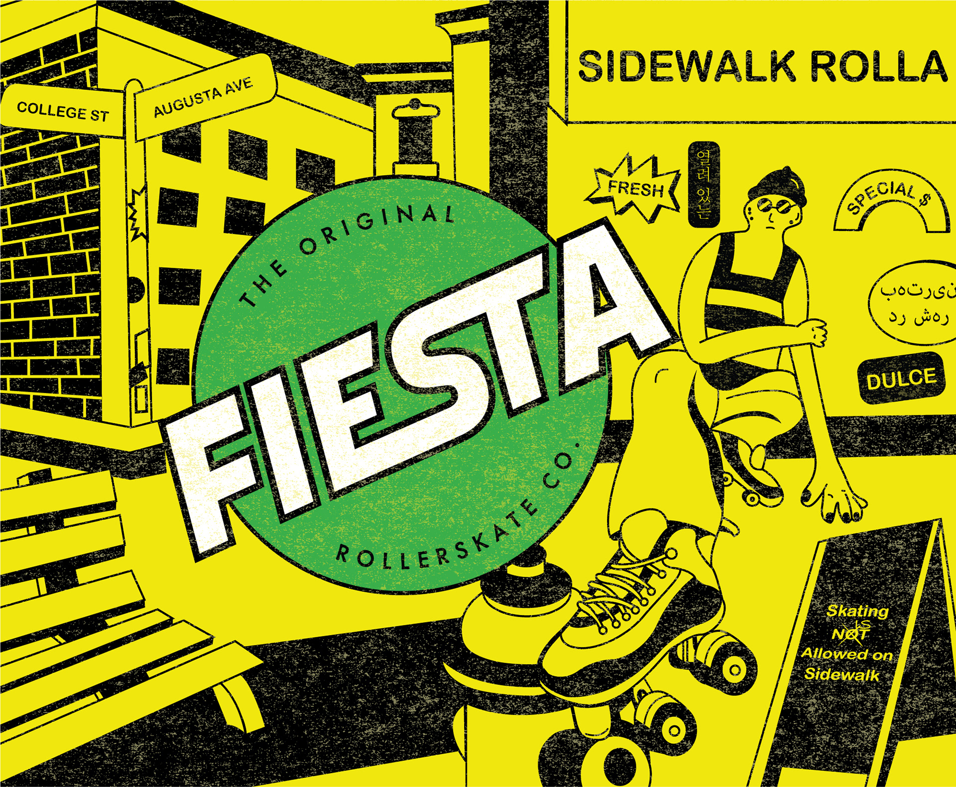
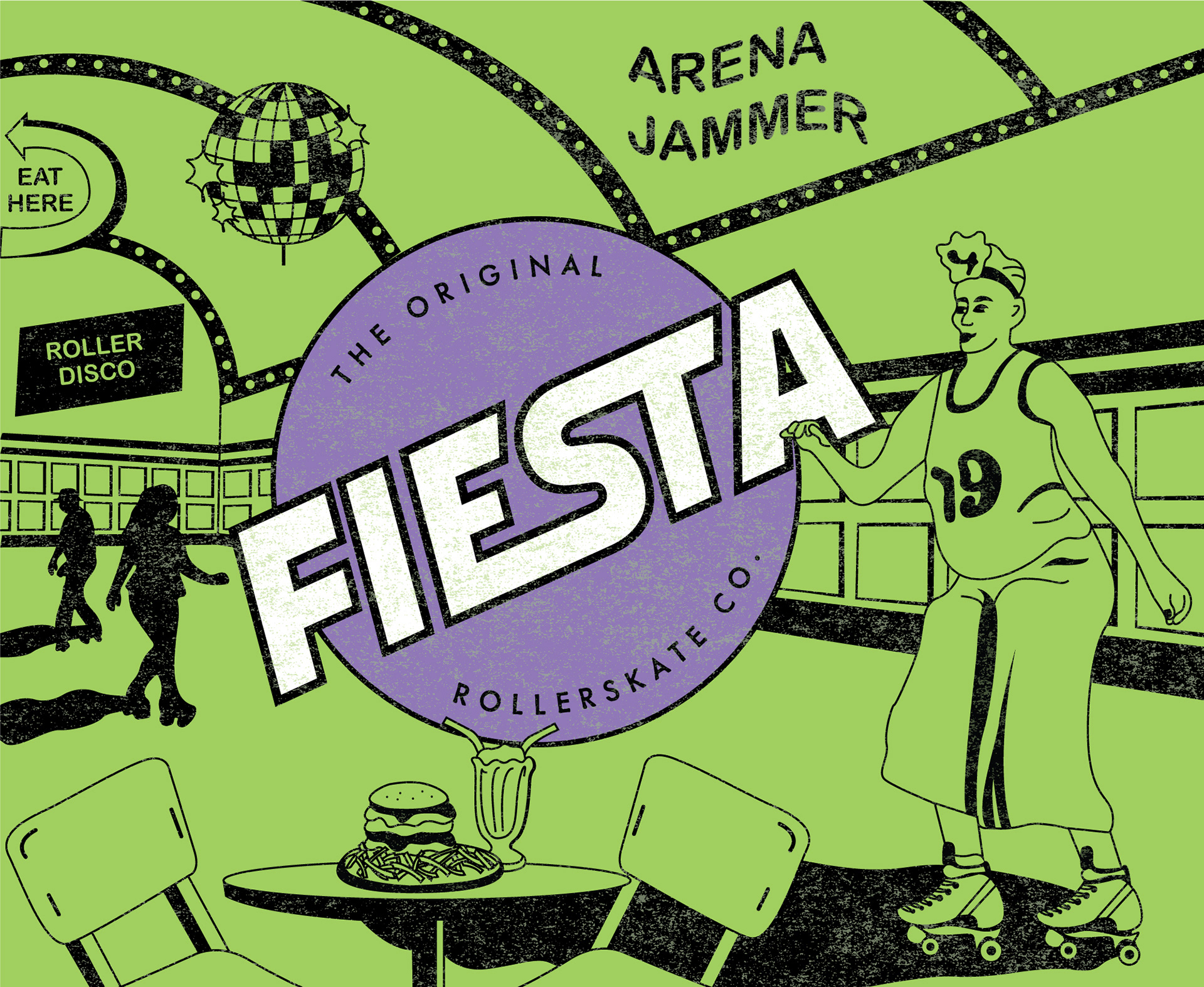
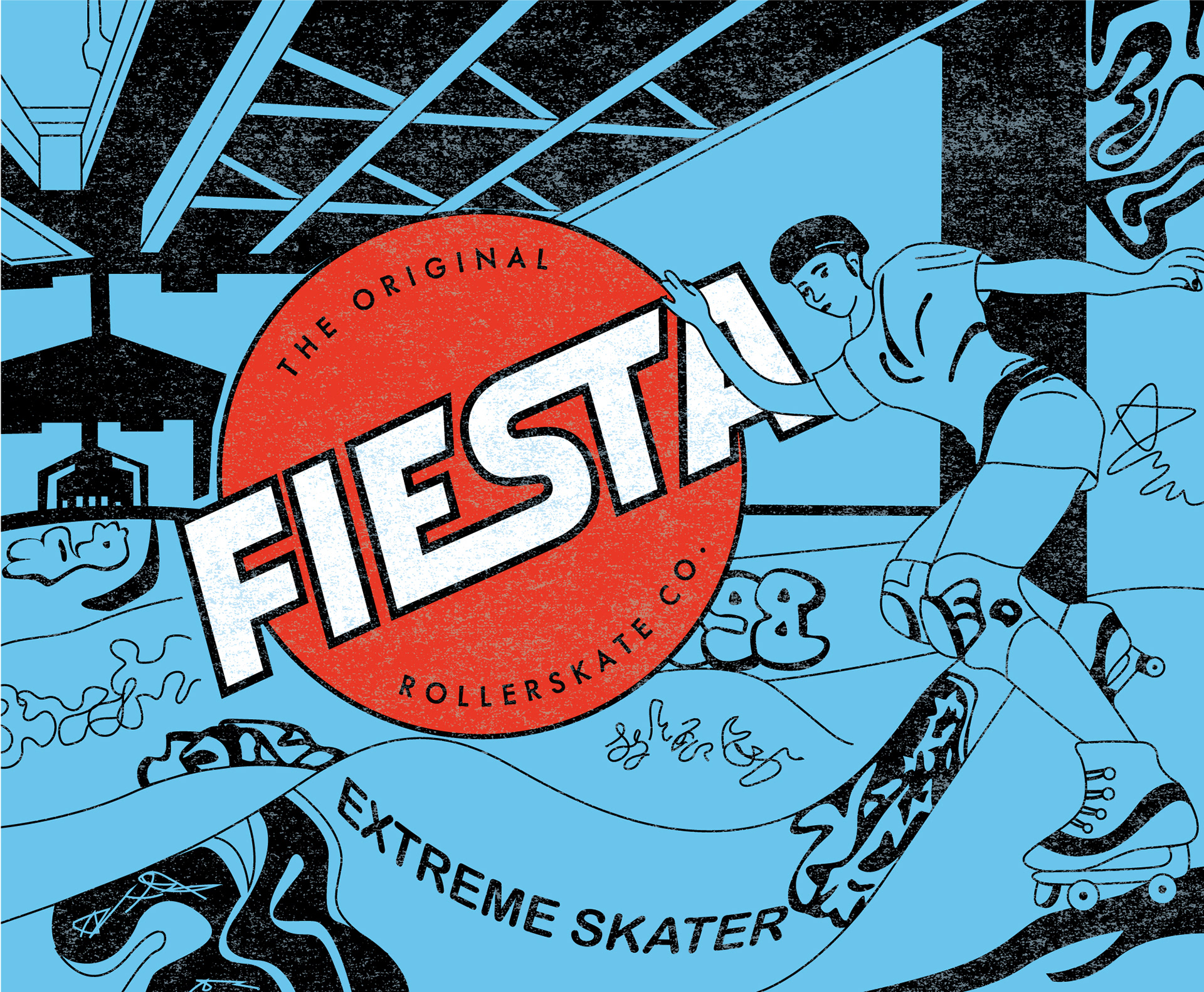
The brand identity for Fiesta RollerSkate Co. is fun, informal and bold. The brand’s name is celebratory and reflects the strong social nature of the sport. Targeting an emerging market of recreational skaters, the brand’s product and imagery celebrates the places and many ways that everyday people enjoy the sport of rollerskating.
Design Touch Points
Branding, Packaging Design, Illustration
🏆 This project won an Indigo Award for Illustration in Graphic Design.
Logo & Packaging Graphics
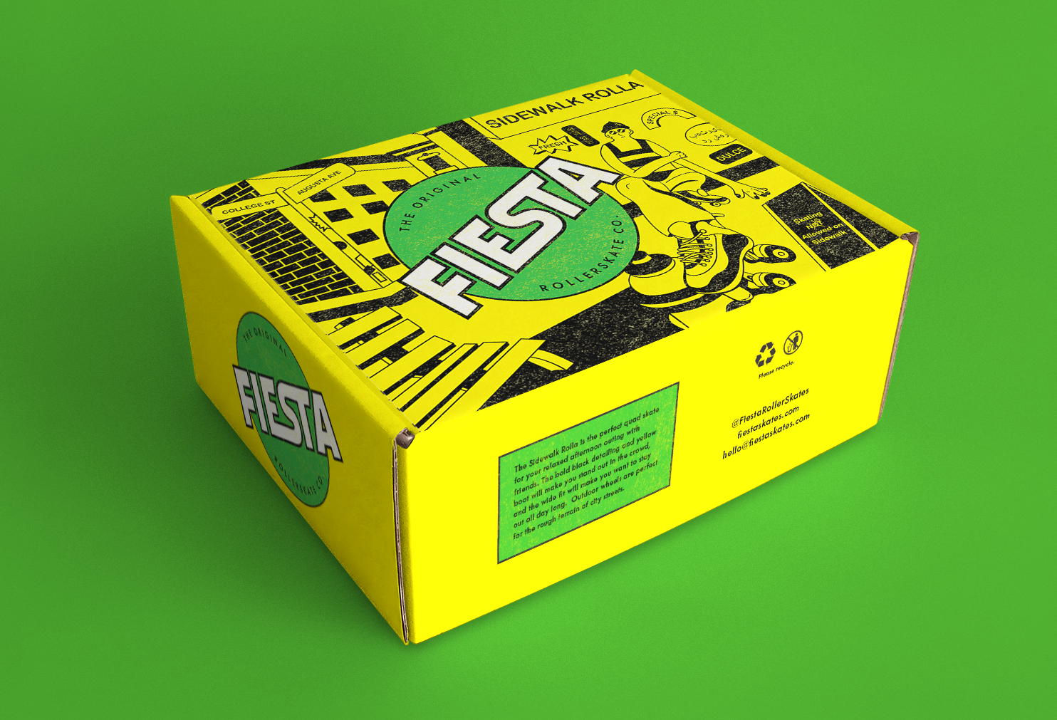
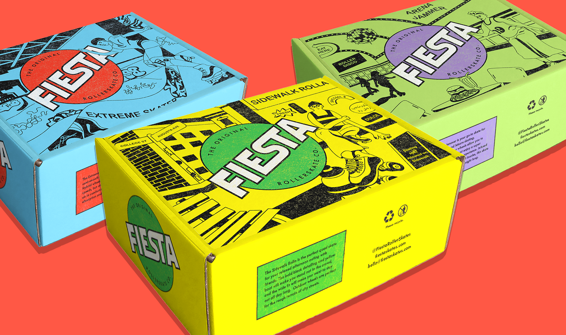
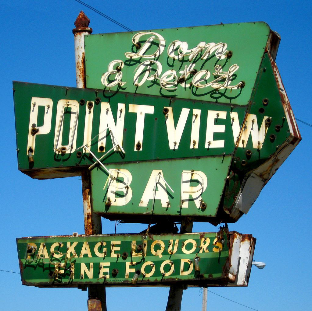
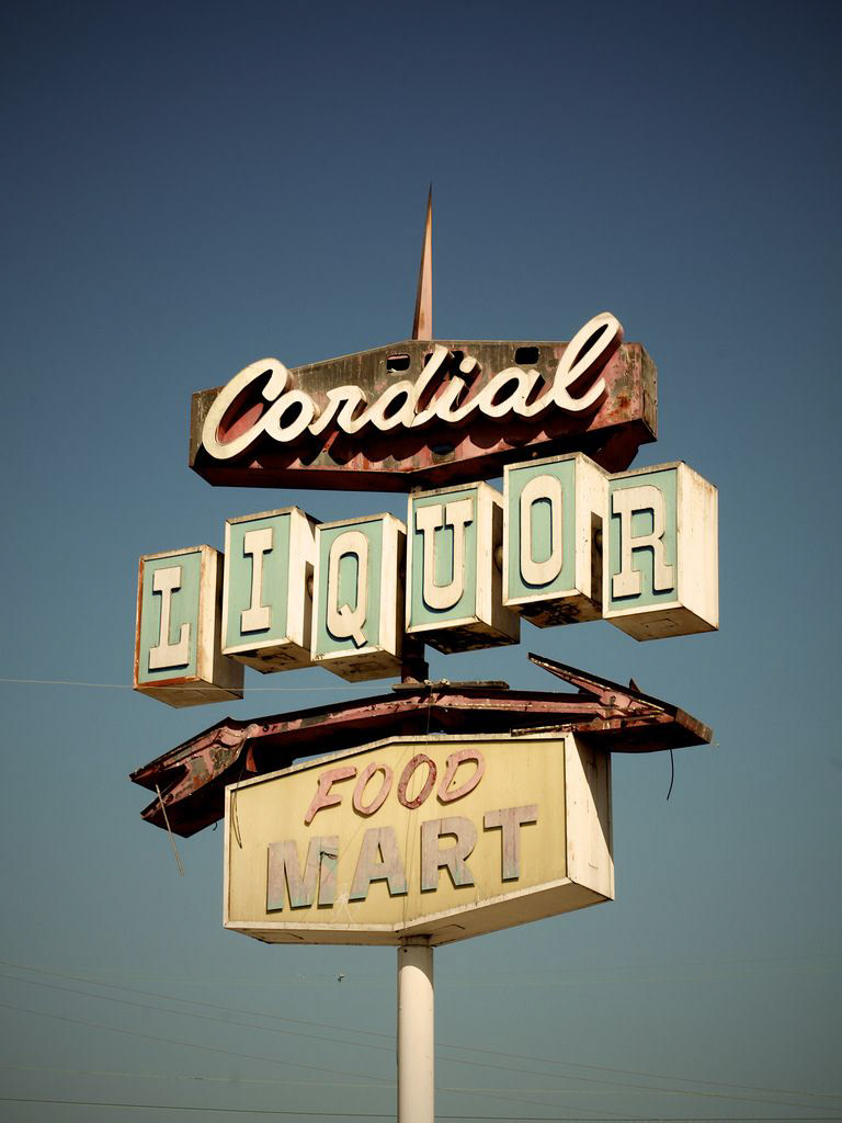
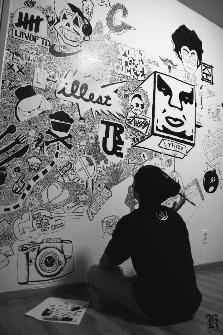
The logo, with its curves and circular background, conveys the smooth, freeing experience of being on roller skates. A gender-neutral colour palette and illustrations help promote the brand as inclusive and welcoming to all. Outdoor signage is a source of inspiration for the typography for the brand, while a gritty paper texture and doodle-style illustrations give an informal, grassroots feel.
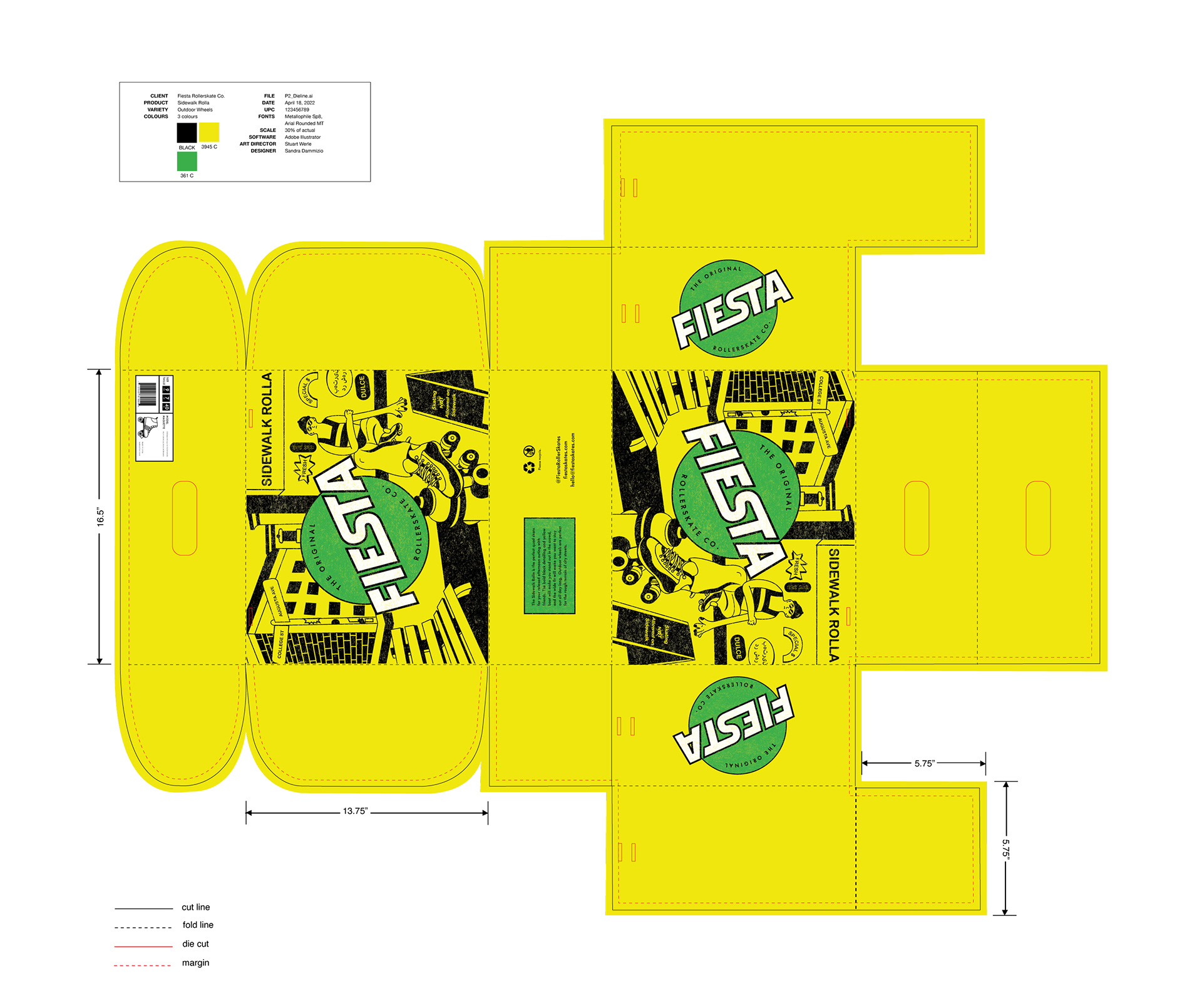
Packaging die-lines
The packaging die-line has a unique structure with die-cuts on the sides that allow the consumer to attach straps and use the box as a long-term transport and carrying case for their skates. Each SKU is gender-neutral and has unique graphics and illustrations that reflect the use (indoor/outdoor/hybrid wheels) and personality of the skate.